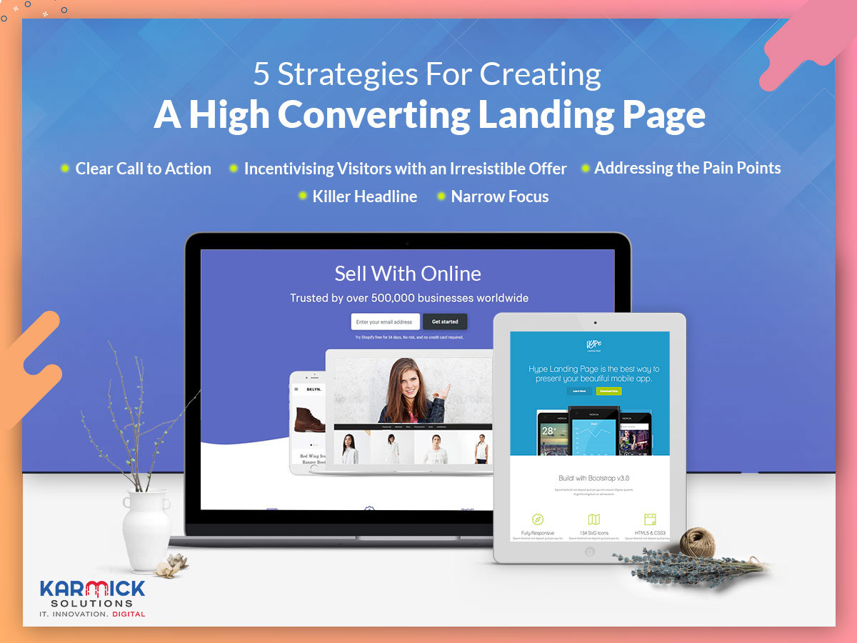
First impressions always matter. For online visitors, the landing page of a website is the first impression that they have of a business. Typically, visitors will come to a website from Google AdWords, as a part of a product launch campaign, display advertising or social media. It is always the intention to get the visitors to perform a certain action such as the submission of their email id or signing up. When we optimise the landing page of a website, we enhance the user’s experience. This, in turn, leads to higher conversions.
Landing page optimisation may be defined as the method of improving the design of the landing page so as to generate more leads and increase the engagement of the visitors. Landing pages are the ideal places to optimise since the maximum traffic of any website is directed towards this page. A well-optimised landing page that leads to healthy conversions adds substantial value to the overall ROI of any business.
Below we discuss 5 ways in which we can optimise a landing page.
Clear call to action
One of the most famous mantras in sales is “Always Be Closing.” This should be the idea behind a well-optimised landing page as well. The most effective way to accomplish this is by creating a clear call to action or CTA.
A call to action may be defined as what we want our visitors to perform – signing up for a newsletter, submission of one’s email id etc. A CTA is a nudge along the path of conversion. It is the persuasion and the effort to convert an interested visitor into a paying customer. As such, it is better not to throw too many CTAs towards a prospective customer. The best landing pages almost always have only one CTA.
A good CTA should be rigorously tested including the placement of the button, its size, and colour. Even the copy of the text used in the CTA should be tested with a demure copy such as “support our cause” being tested against a more aggressive copy such as “donate now.”
When designing the CTA, we have to make sure that the button is clearly displayed on the landing page. Visitors should not be made to guess which the CTA is. If need be, we should use visual cues such as arrows and images to direct the attention of the visitor to the CTA button. It is not advisable to have multiple CTAs on a single landing page. If there are multiple CTAs, we should ensure that the secondary CTAs do not distract from the primary CTA. If need be, we should repeat the CTA on the page to make it easy for the visitors to access it.
Incentivising visitors with an irresistible offer
Many websites make offers to their visitors in order to make them perform the desired action which helps in the conversion rates. Typically, after a visitor has spent about 10 seconds on the site, a pop up offers the visitor some form of savings in the form of discounts etc. if they choose to become a paying customer. A precise and to-the-point offer goes a long way in enticing a visitor into converting into a paying customer and adds value to the company. While making the offer, it is important to convey to the visitor that the benefit is immediate.
Addressing the pain points
In order to create a relevant and pertinent landing page, it is very important to know what the visitors to your site want. Almost all visitors are looking to alleviate their problems. A landing page that provides a direct solution to a problem statement is more likely to have higher conversion rates than pages that do not.
Having a landing page that successfully remedies pain points has its own advantages. First, visitors who are satisfied with the service that is provided by the website are likely to share the link to the site with their friends who are also suffering from the same problem statement. This will greatly increase traffic to the site and consequently, conversions. Second, users who have been able to remedy their issues with the help of a site are very likely to return again, thereby increasing chances of repeat business.
Killer Headline
A headline addresses a lot of issues – interest, understanding, and attention. It is the first thing that visitors see when they visit a landing page. A good headline should be able to accomplish the following –
Narrow Focus
The landing page of a website should always be as simple as possible. Research shows that the more options we provide to our visitors, the longer time they take to arrive at a conclusion or a decision. A simple and minimalistic website makes it that much easier for a visitor to perform the desired action.
When creating a landing page, one should make efforts to ensure that the CTA stands out as much as possible. Any other clickable links or buttons should preferably be done away with. The landing page should comprise only of content that will aid in making the visitor perform the desired action. Most importantly, when deploying a form to obtain information from visitors, we should strive to create a form that does not ask for irrelevant details but is to-the-point and gathers all the vital information.
All said and done, the most important landing page for any website is its homepage. Time and again marketers have found it to be a daunting challenge to optimise the home page in such fashion so that visitors are persuaded to perform the desired function.