The second quarter of the year in full swing and it is time to retrospect whether the user experience (UX) design of your website or app is ready to make a mark in 2018 or not. After all, UX is one of the most vital aspects to survive in an environment of cut-throat competition.
If the user experience is poor; you will soon lose your existing customers, potential visitors, search engine ranking, and most importantly revenue.
According to research findings by Adobe published by Marketing Charts, “Design matters to consumers, as two-thirds (73% among Millennial) would rather read something beautifully designed than something simple and plain if they had only 15 minutes with which to do so”.
So, let’s dive deeper into the five user experience design trends that will likely dominate 2018.
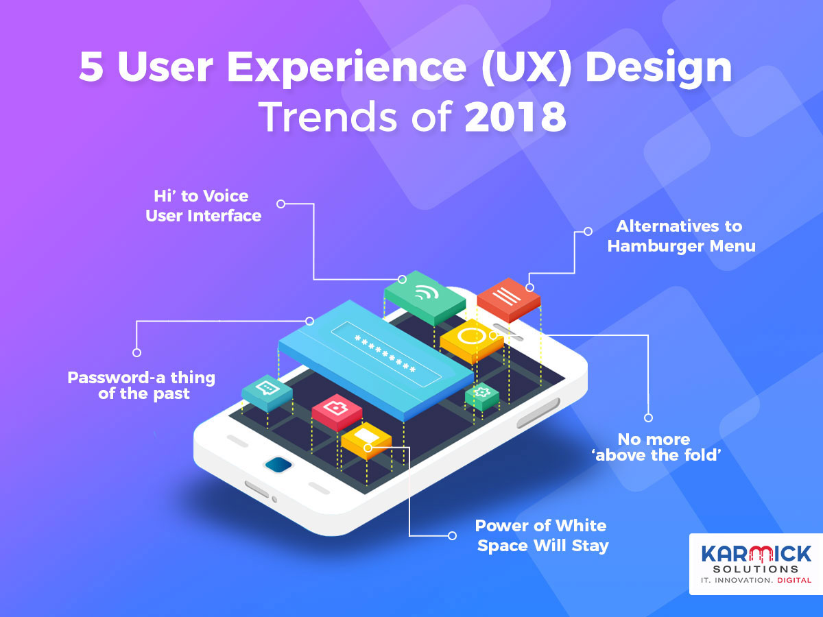
1. Power of White Space Will Stay
White space also known as the negative space will stay in 2018, and perhaps its use will increase manifold. The reading habit has changed over the years. People, rather than reading content over the web now prefer to scan it within a matter of few seconds. So, the focus will be more on creating ample breathing room to retain their attention on the website page.
Example-Asana, a project management tool for the team has a website with ample white space. It does not let the visitors shift their focus from the page.
2. Alternatives to Hamburger Menu
There are several companies across the world moving away from the traditional hamburger menu. The three-lined subtle button at one corner has now become a devil for UX designers. It is found to reduce the efficiency of users during website navigation.
Also, there are plenty of netizens who are clueless about the menu. It is still popular in several app designs, but the trend will witness a change in the next year.
There will be more alternatives to the Hamburger menu to increase website navigability. Some of the alternatives are as follows:
Example- Spotify has eliminated the hamburger menu from its iOS app. It is now using tabs that have increased navigation clicks. Similarly, NBC News and Redbooth have also ditched the hamburger menu.
3. No more ‘above the fold’
Soon, ‘above the fold’ will become a thing of the past. Many designers have been speculating about its possible end since many years, and finally, the nail has hit the coffin. There is no need to put all the vital information in a limited space while assuming that a visitor will not scroll.
Now, people are quite comfortable with the idea of scrolling through a website if its design is eye-catching. Instead of squeezing the ‘call to action’ button and company logo, the focus should instead be to make it more engaging.
After all, it is too much to ask a person to click on the CTA button who has just arrived on your website.
4. Password-a thing of the past
For many, memorizing passwords for Facebook, email or LinkedIn accounts is a tedious task. Things become worse when they have to memorize passwords for apps or websites too.
Designers have taken a clue already and will probably not enhance user experience in 2018 by making authentication easier. There may be verification codes, voice or face recognition for an accurate authentication.
5. ‘Hi’ to Voice User Interface
Voice user interfaces (VUIs) are no longer alien to web users as VUIs are now used by many who interact with Smart Home Systems. For example, when you give a command to Siri or talk to Amazon Echo, it is all because of the voice user interface. Some designers may use it as an alternative to the traditional graphical user interfaces (GUIs). With more headway in natural language processing, a gradual shift from the use of UX design to voice user interface design can yield remarkable results.
Although it can never replace UX design; it can bring immense benefits to people with disabilities like impaired vision, reading difficulties, and so on.